23andMe Branding
As a constantly evolving product, 23andMe was looking for a way to enhance the visual style to highlight it's mission to make science accessible, understandable and beneficial to people. My role as a designer filled many facets of design, one of which was branding. As the company grew and expanded, so did the design system. I got to take part in multiple brand defining projects that enhanced the consumer experience in navigating through the 23andMe experience.

Welcome Experience
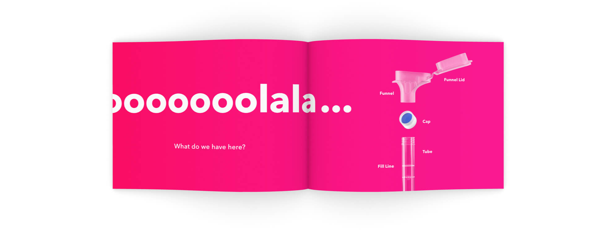
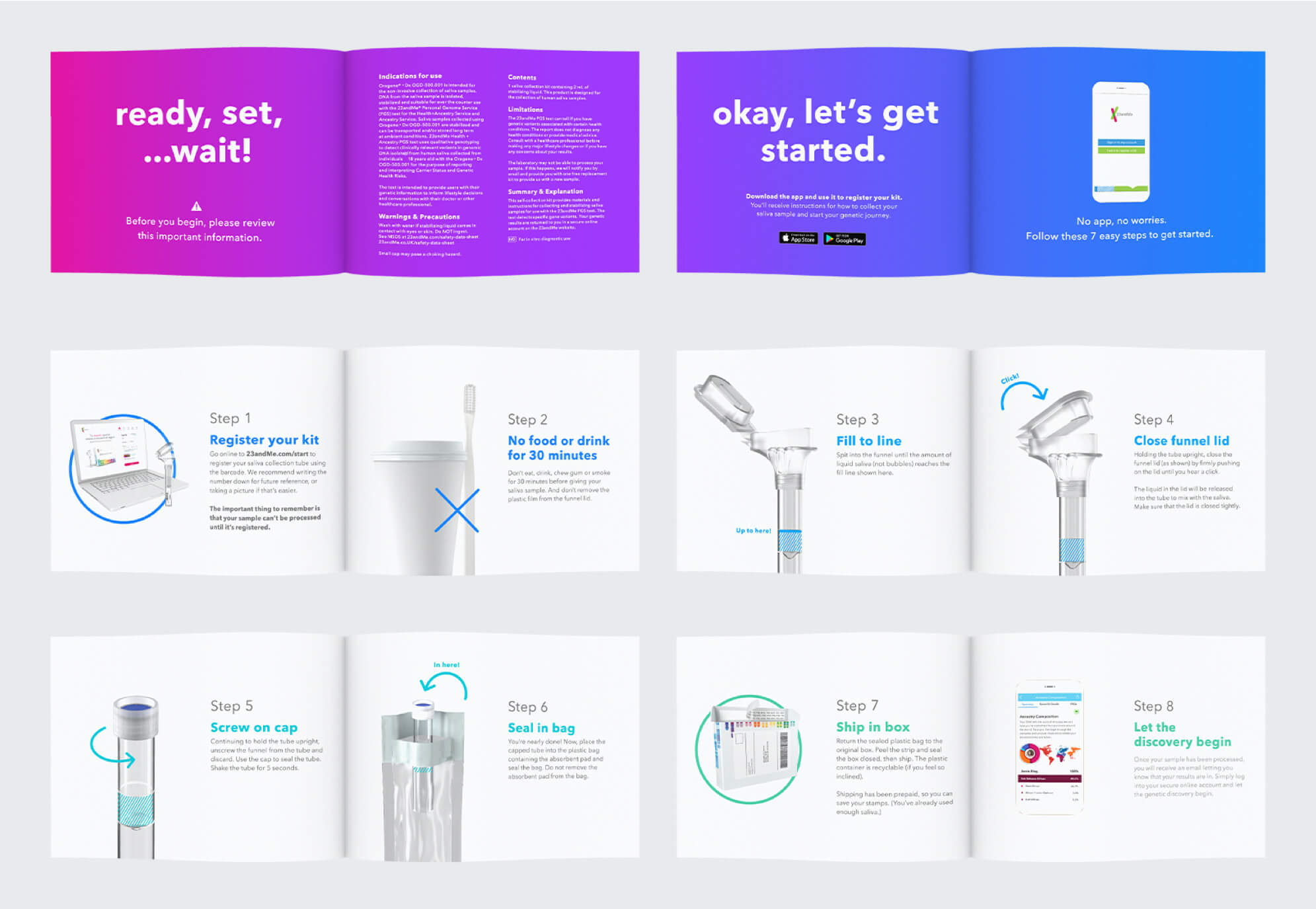
This project was one of the first projects I worked on at the company. Originally a smaller ask, it grew to become a more impactful project once we understood the role it could have. The first phase of this project was to redesign the book insert that was found in every single DNA testing kit. This booklet is one of the first interactions people have with our brand and will influence how they view 23andMe. Therefore, we took this as an opportunity to update our visual and copy personality to be more engaging and exemplifying of our brand values. The insert was previously a standard solid green card with a few directional statements. The challenge with the redesign was adding in instructions without being too informational dense, making it fun and exciting without losing the educational value and creating a welcoming experience to the kit and app.
Role: Lead Designer | Copy: Kevin Cranfill


Brand Voice
Majority of the copy was written by the copy writer, but I was welcomed to offer up ideas. One of the ones that stuck was the "ooooolala" on the first page of the booklet. Our team felt that the energy of the phrase mirrored our excitement for users who were about to embark on their DNA journey. "Ooooolala" also became a phrase in the marketing team to call out fun moments!


Visual Growth
Gradients were not commonly used until after this booklet. I made the decision to create gradients based off of our set brand colors when I realized the whole rainbow was basically in our color set. However, we've been limiting ourselves by keeping them at solid colors. The change to using gradients helped objects stand out by adding dimensionality and depth. The gradients are also very versatile- depending on the design, it can be bold or subtle. Since we were using solid colors for years, this update of combining colors gave the brand a completely new feeling without feeling like a completely new brand. The transition to gradients also reflected the transition and growth of 23andMe. Just like our new gradients, our company is a blended, seamless and colorful journey. Another aspect of gradients is that they're attention grabbing and perfect for influencing retail, outside promotions, social media and so on. Other new elements created during this time was the use of arrows and how it, as our team liked to call it, "added a bit of razzmatazz" to the page. The arrows functioned to guide the user into understanding movement but also provided animation on a printed asset. This arrow will come to evolve over time and become an element of the 23andMe experience.

23andMe on Social
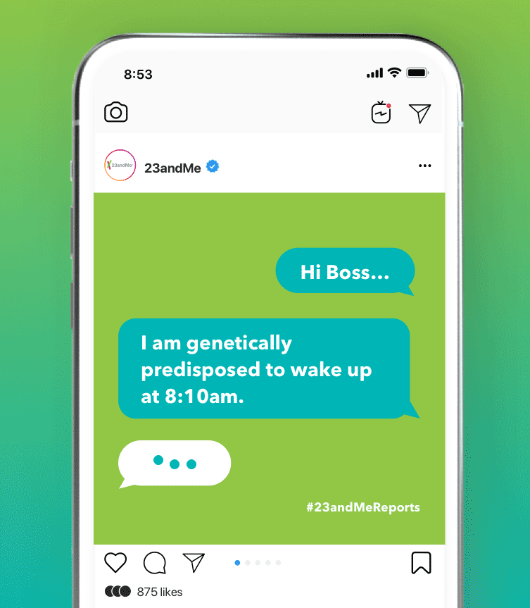
Social media is an important space for any company to build a presence and relationship with consumers. I love designing with people in mind and this area was prime for me to take our experiment with our brand and get it to people around the world. The joy of social media is its wide range of audiences and how diverse content can get. With my work in social, I got to build stories to capture our audience and see how it influenced our metrics.
Role: Lead Designer, Copy Writer
Challenge
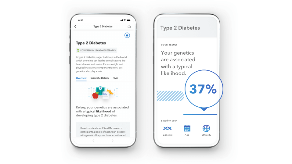
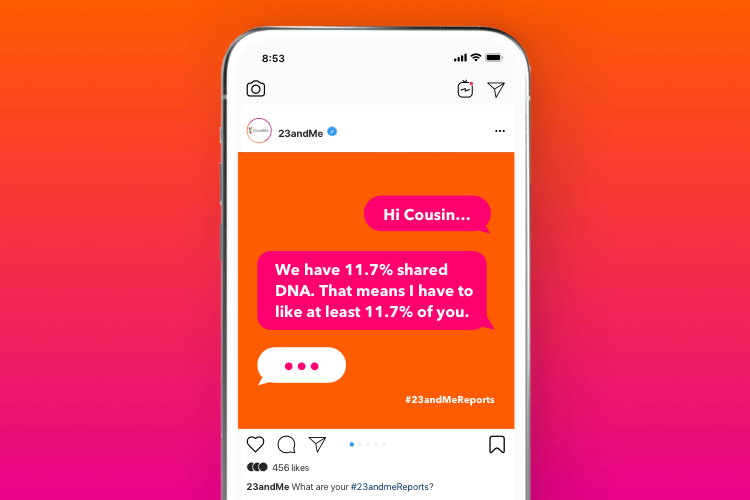
Reports are an elemental aspect of the 23andMe experience and are also one of the hardest things to get customers to understand. Most people do not know of the depth and variety that 23andMe reports have to offer. To us, 23andMe's most important factor is our powerful health results that can help people take action on their own health. It's so empowering to know that you can get a chance to change, manage or even prevent certain health conditions.
For example, 23andMe provides health reports ranging from Type 2 Diabetes, to Cystic Fibrosis, to Caffeine Consumption. There's also results like Cilantro Taste Aversion, Asparagus Odor Detection and Misophonia (hating the sound of chewing). There's a lot that genetics can influence and to get that across to a wider audience, I created a series of how we can present our reports in a sharable and engaging manner. We have a set design for our reports on the product side and the marketing team redesigned certain reports for marketing purposes. Social however, is a different platform and I created various other ways to showcase the depth of it all but with a twist.


Process
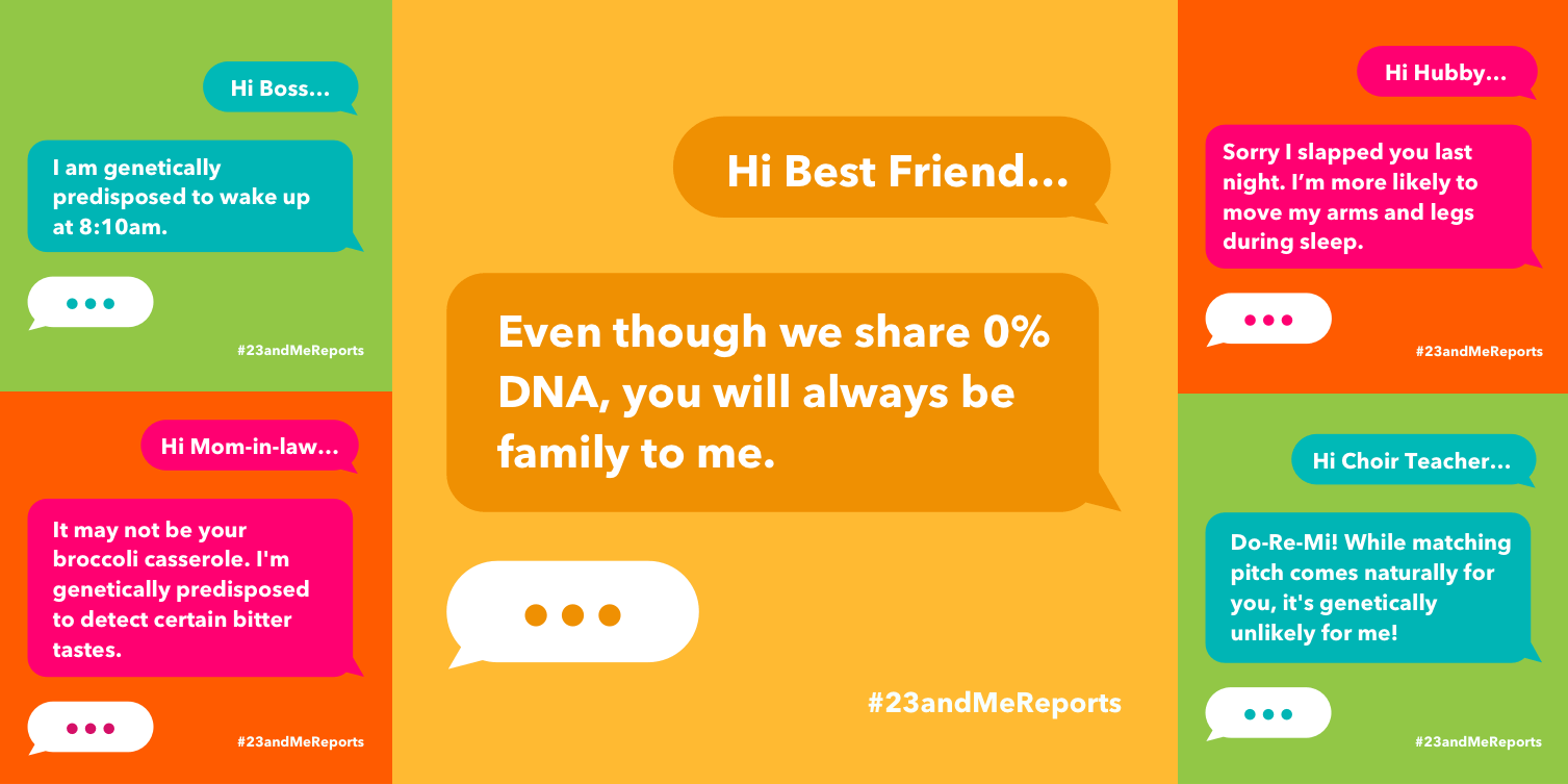
The idea, design and copy was initiated by me. This stemmed from a project where I had to repurpose another design to showcase our reports and I felt it lacked excitement and information-especially for Instagram. I put myself into the shoes of someone with no knowledge of 23andMe/health reports and looked to educate and entertain. I simply just wanted to make it relatable. The reports referenced are Wake-Up Time, Bitter Taste, Sleep Movement and Musical Pitch. The centered design(yellow) does not reference a report but sends out a sweet message instead.

Science is Fun
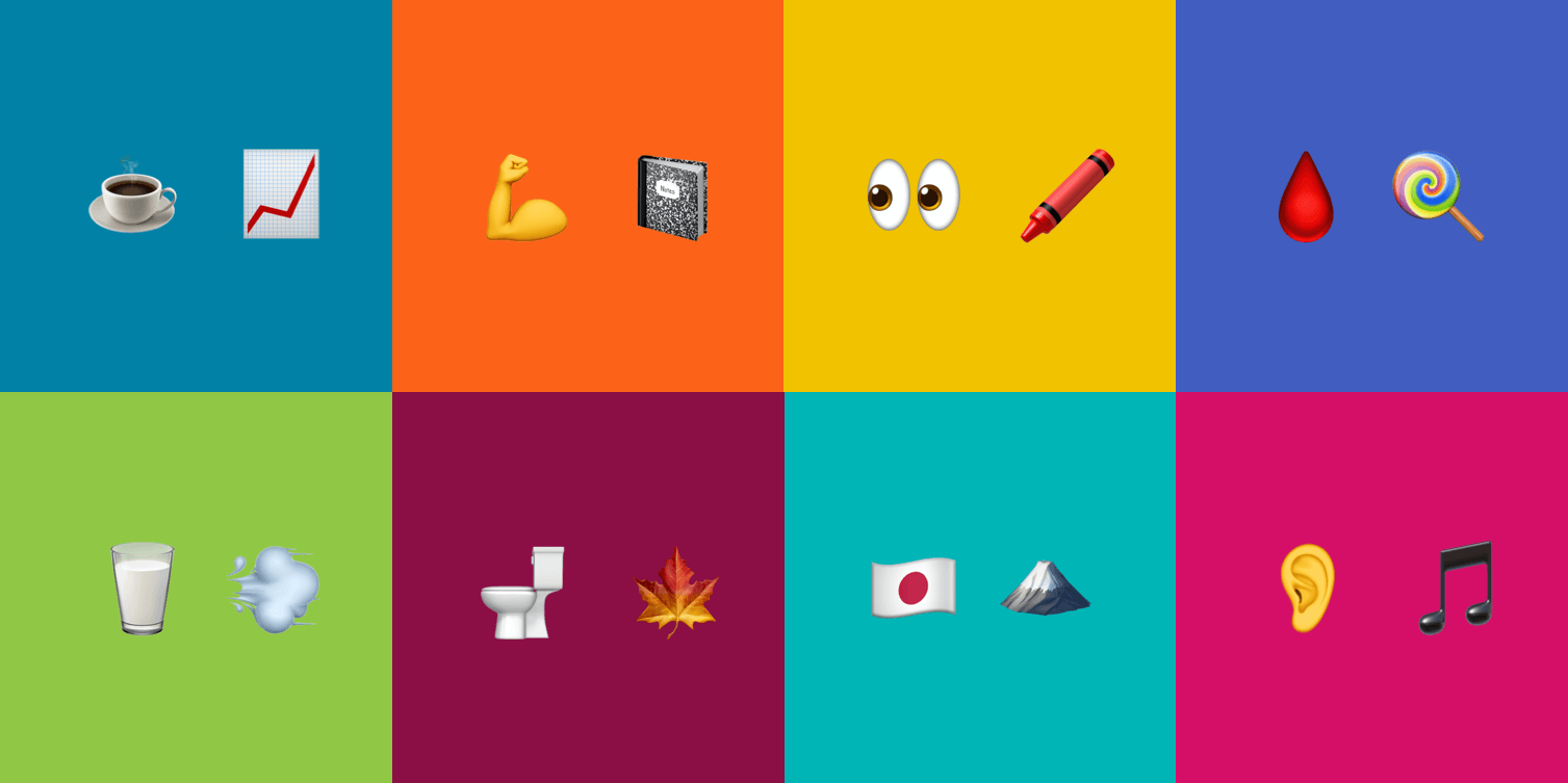
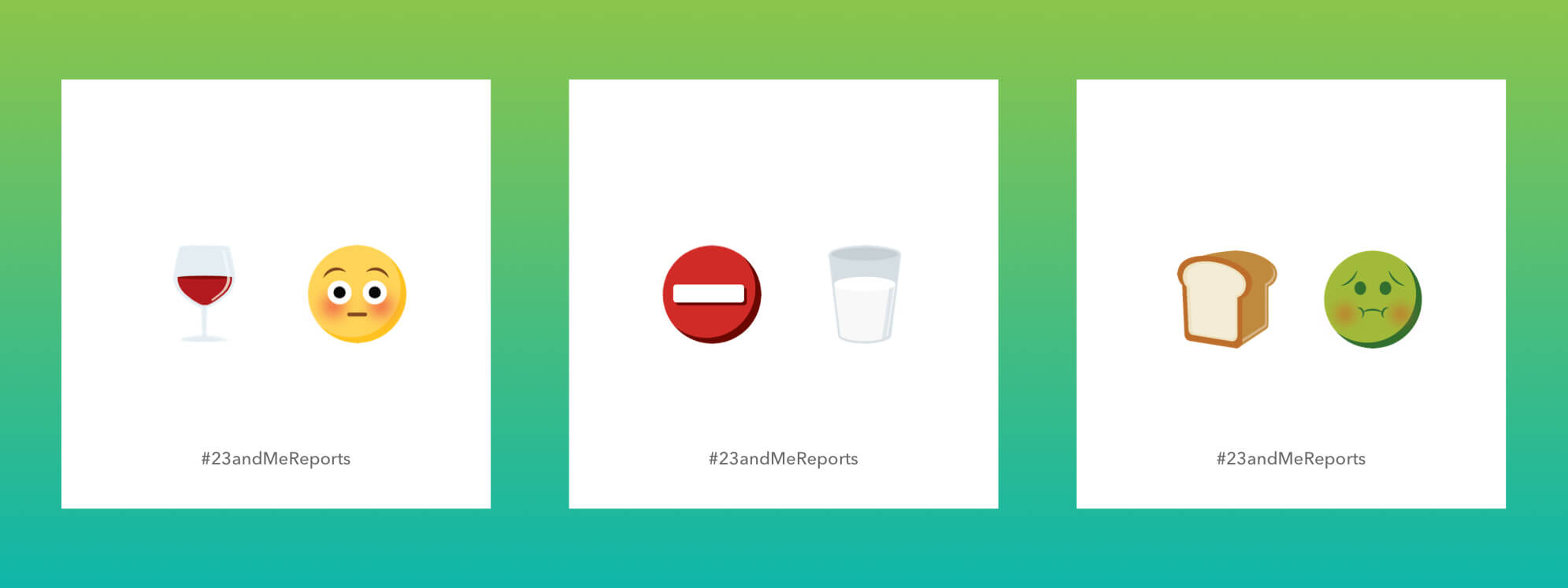
This is a work in progress that I initiated and designed. The set of three are emojis I created to illustrate our reports (Alcohol Flush, Lactose Intolerance, Celiac Disease). I wanted our 23andMe social experience to do something we always talk about at 23andMe- making science fun. With that in mind, I created this series to engage social media users. Can they guess what this report is? Who will get it right first? If they don't know, why not take this moment to learn what it is? These posts will allow for us and users to be part of the conversation together. The use of emojis fits well in the social media space and its playfulness checks off "making science fun" and as a plus, it's educational too.
The other emoji sets are sketches of other reports that I have yet to convert into a 23andMe-style emoji. Can you guess what reports they represent? (Hint: Message me if you need help!)


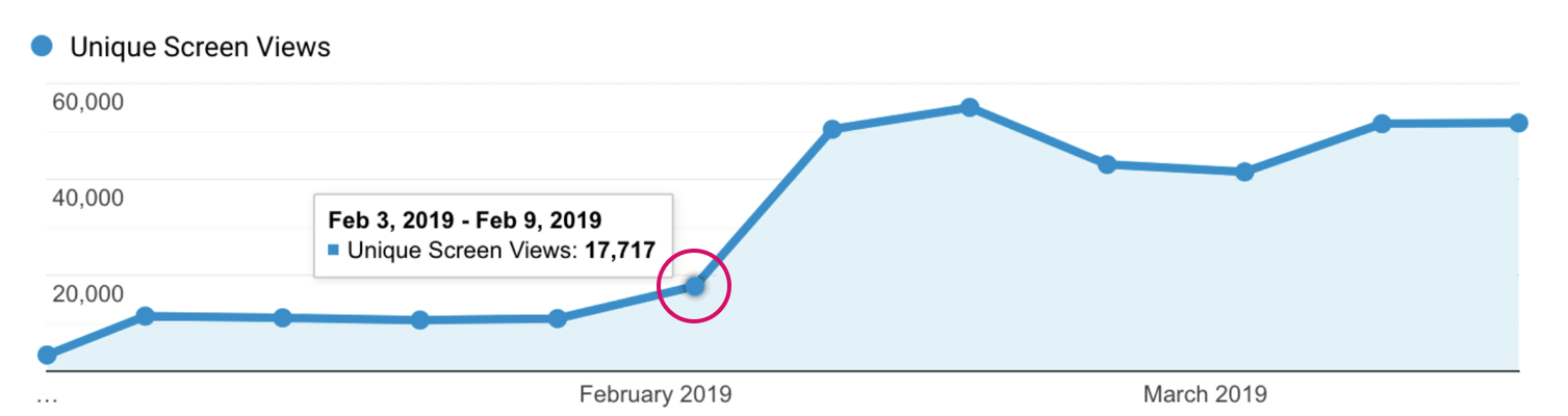
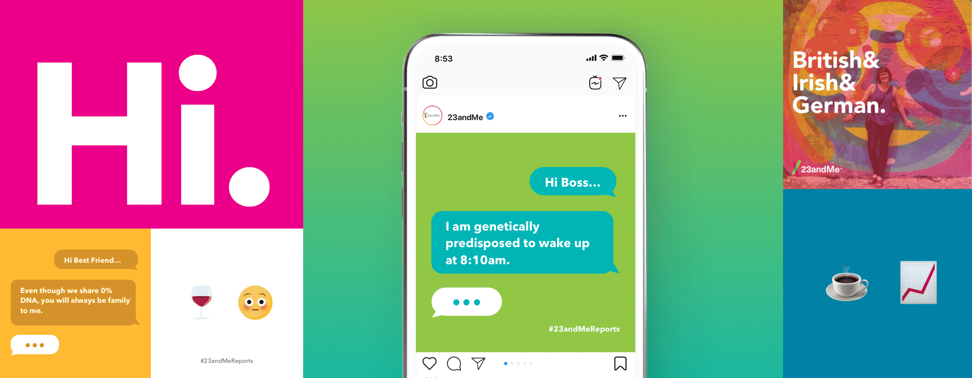
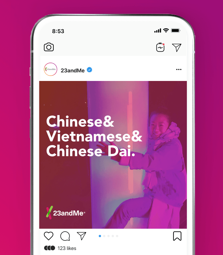
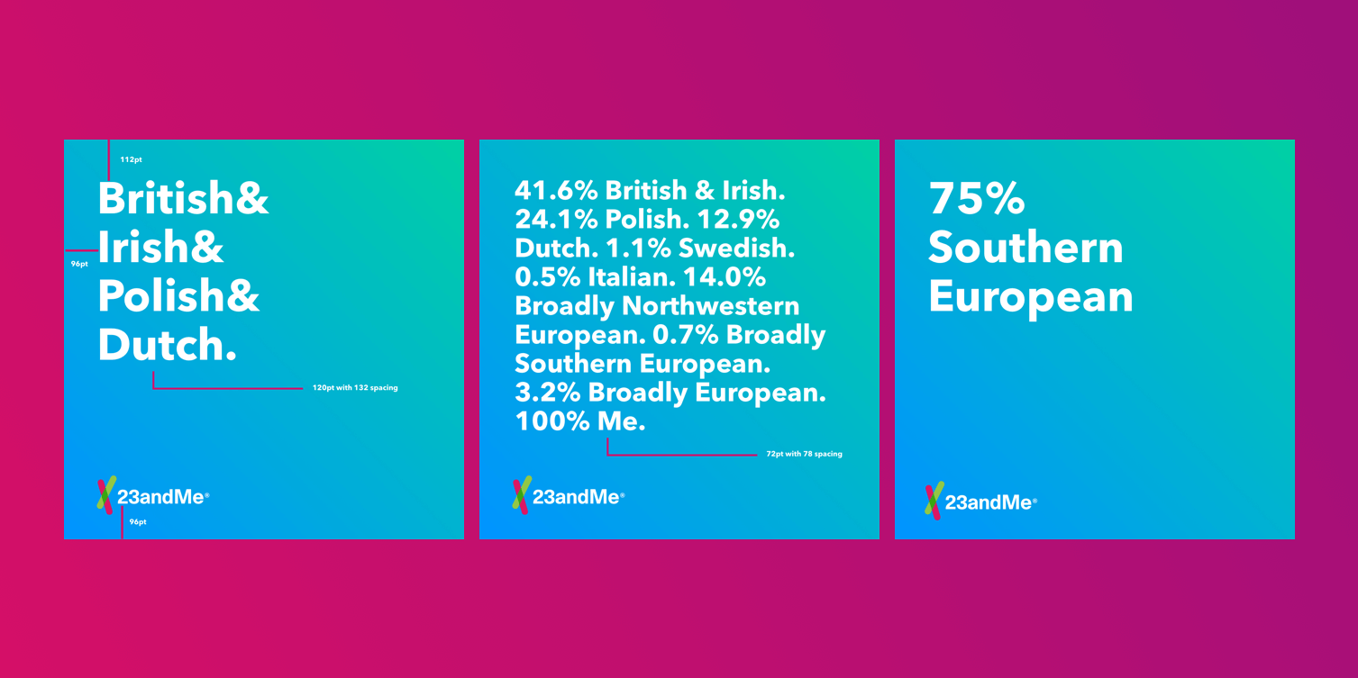
23andMe Social Sharing Feature
When a customer takes the 23andMe DNA test, the anticipation for those results build up in the weeks that pass. Once that amazing moment of finding out who you are happens, whether if the results are unexpected, shocking or even, unsurprising, it's a moment to share. This Social Sharing Feature was created once we started noticing that a lot of customers were posting screenshots of their results online. However, the screenshot from the product were never designed to be shared in a social format. The information dense screenshots did not represent our customers' results or the brand in the best light. The social platform asks for a quick take, something easily digestible and "thumb-stoppable". To achieve this, we decided to provide tools for our users to create a Instagram worthy post.
Role: Took over as Project Lead from Allie Shorin, worked to build it with Mike Villamejor (Product Designer) | Copy: Elizabeth Owuor


Process
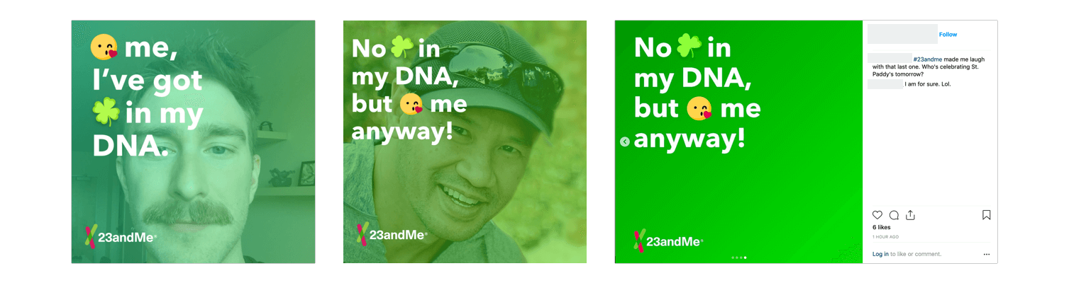
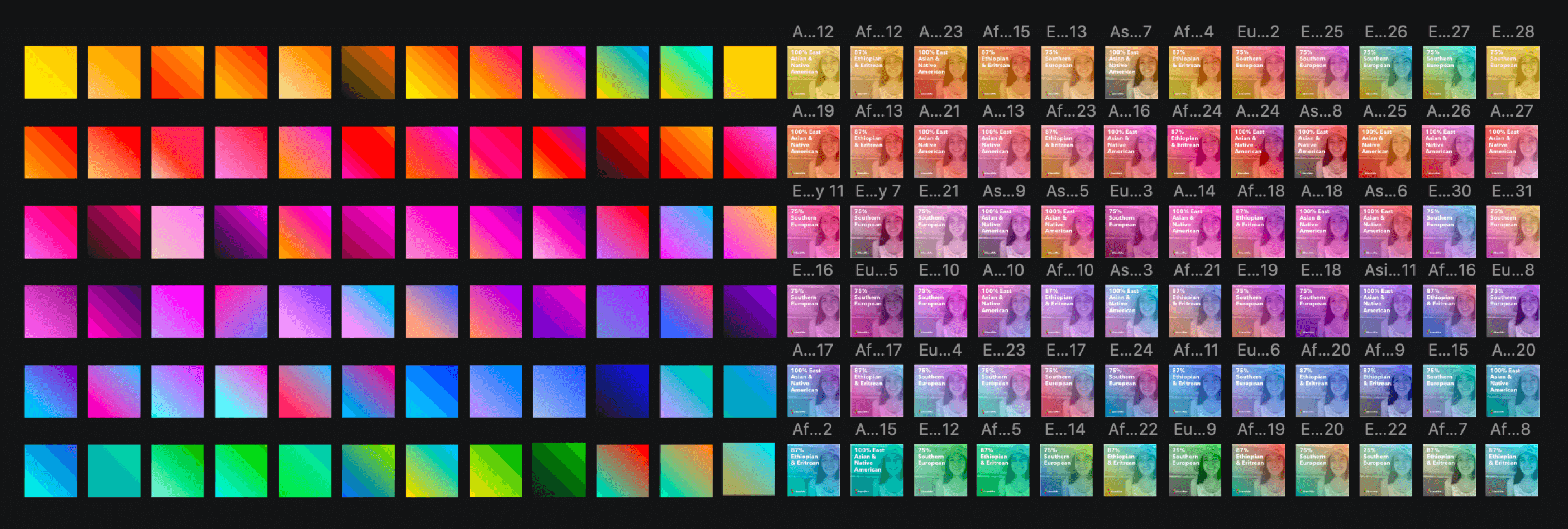
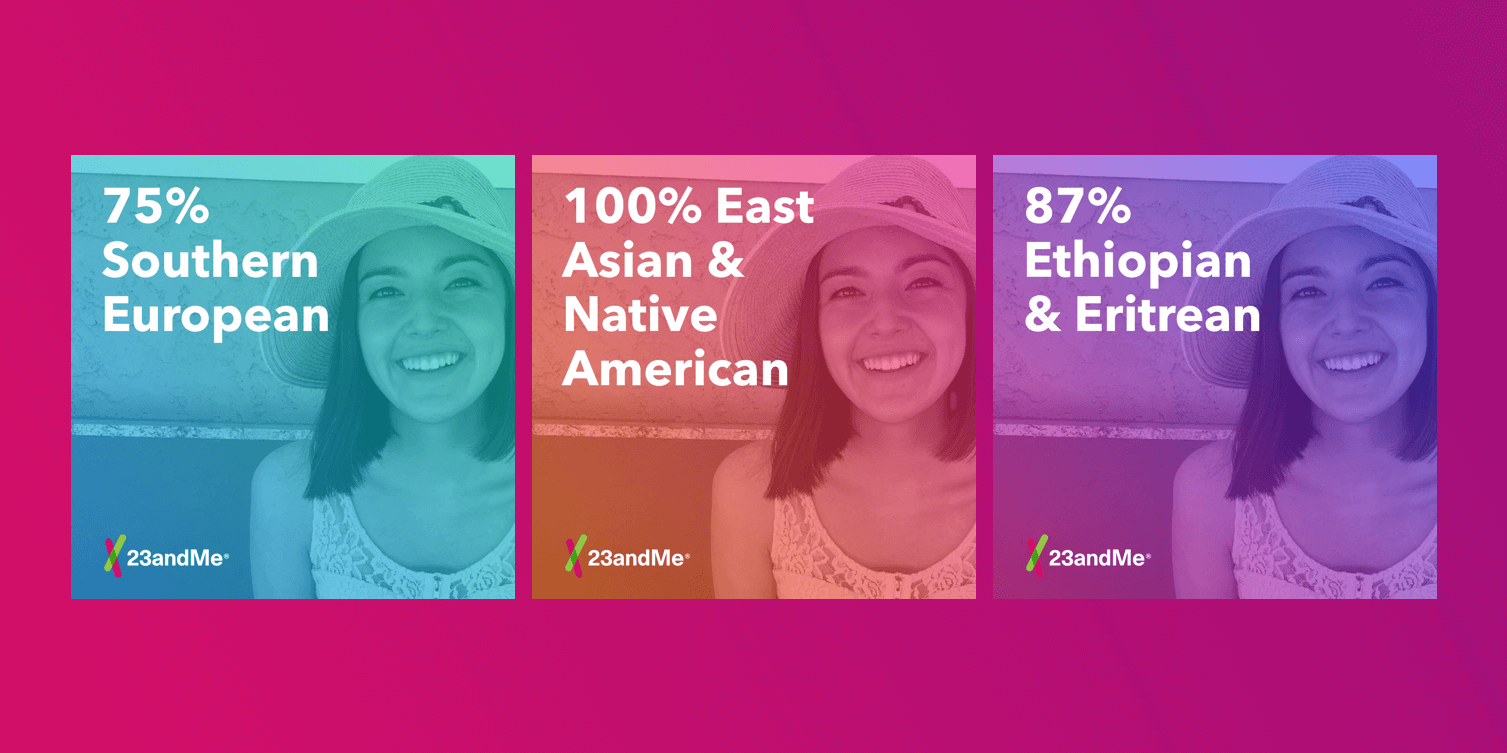
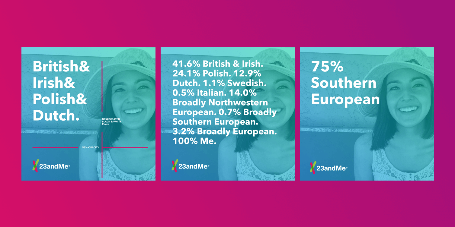
I took over this project after initial designs by Allie were presented and approved. I worked together with the product team to ensure the final share cards supported brand consistency and could grow beyond this one moment. It was in discussion to use the template for moments like St. Patrick's Day, Father's Day and cultural holidays. The final result was a feature that allowed users to create a social post with their 23andMe result, a photo of their choosing and a gradient field for personalization. The user could choose between 3 versions of their results and pick from 3 gradients to layer over their photo.

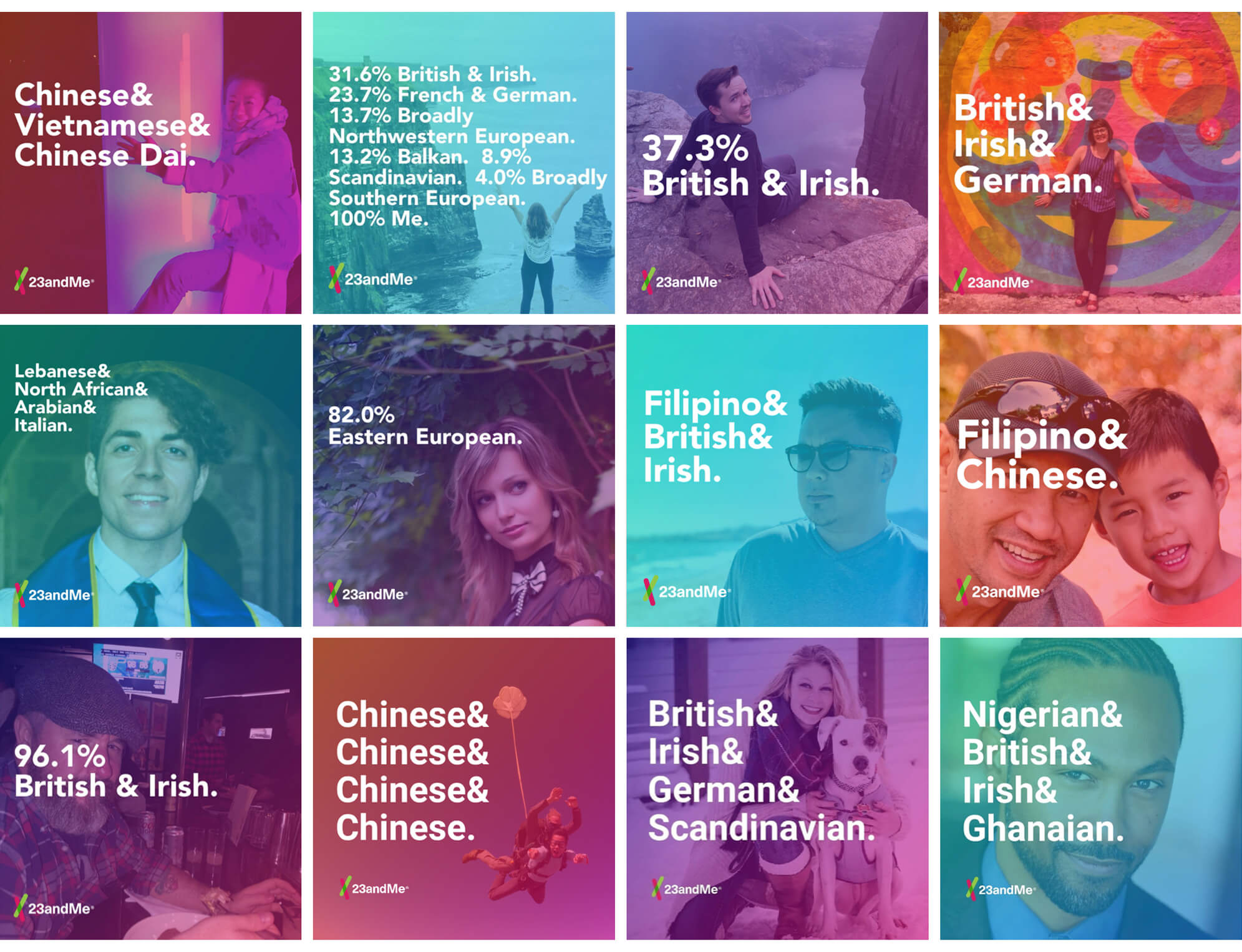

Increased Discoverability
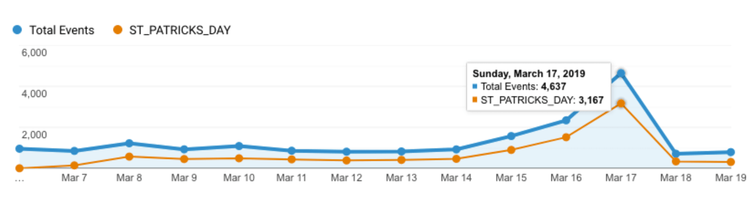
We launched and saw an increase in users posting their results. That was just the beginning, we also pushed out our seasonal St. Patrick's Day template and it was shared over 10,000 times.