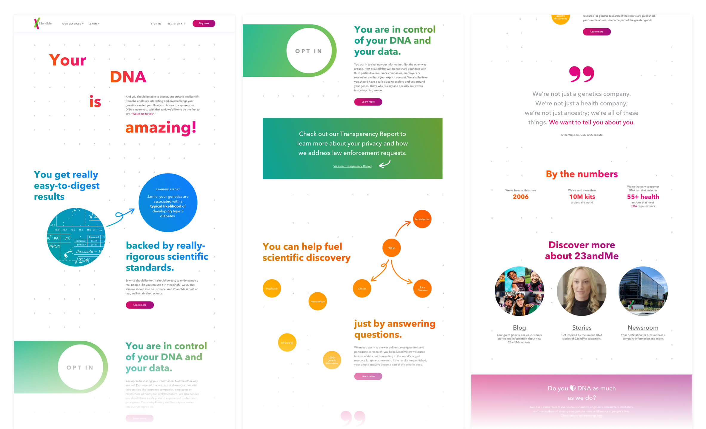
23andMe About Page
A page to inform visitors of the mission and purpose of 23andMe while speaking to the key differentiators that separate it from the competitors. The current 23andMe website does not have an about page-but we're about to change that. This was an opportunity to bring together all we've done in the past 14 years as a company and challenge ourselves to condense who we are into one page. As the lead designer on this project, I needed to build upon the existing brand, collaborate with the copy writer to create a cohesive visual and copy flow and work with engineering to deliver and build the page. The main objectives of our about page is to highlight the credibility of our science, privacy, security and research.
Role: Lead Designer with support from Jennifer Hsu | Copy: Beau Unruh

Observations
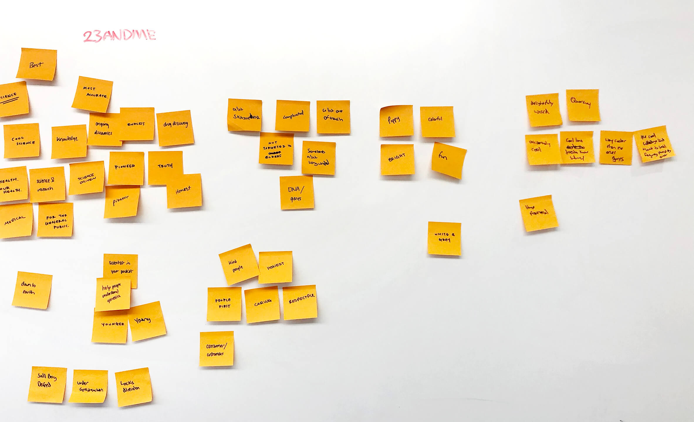
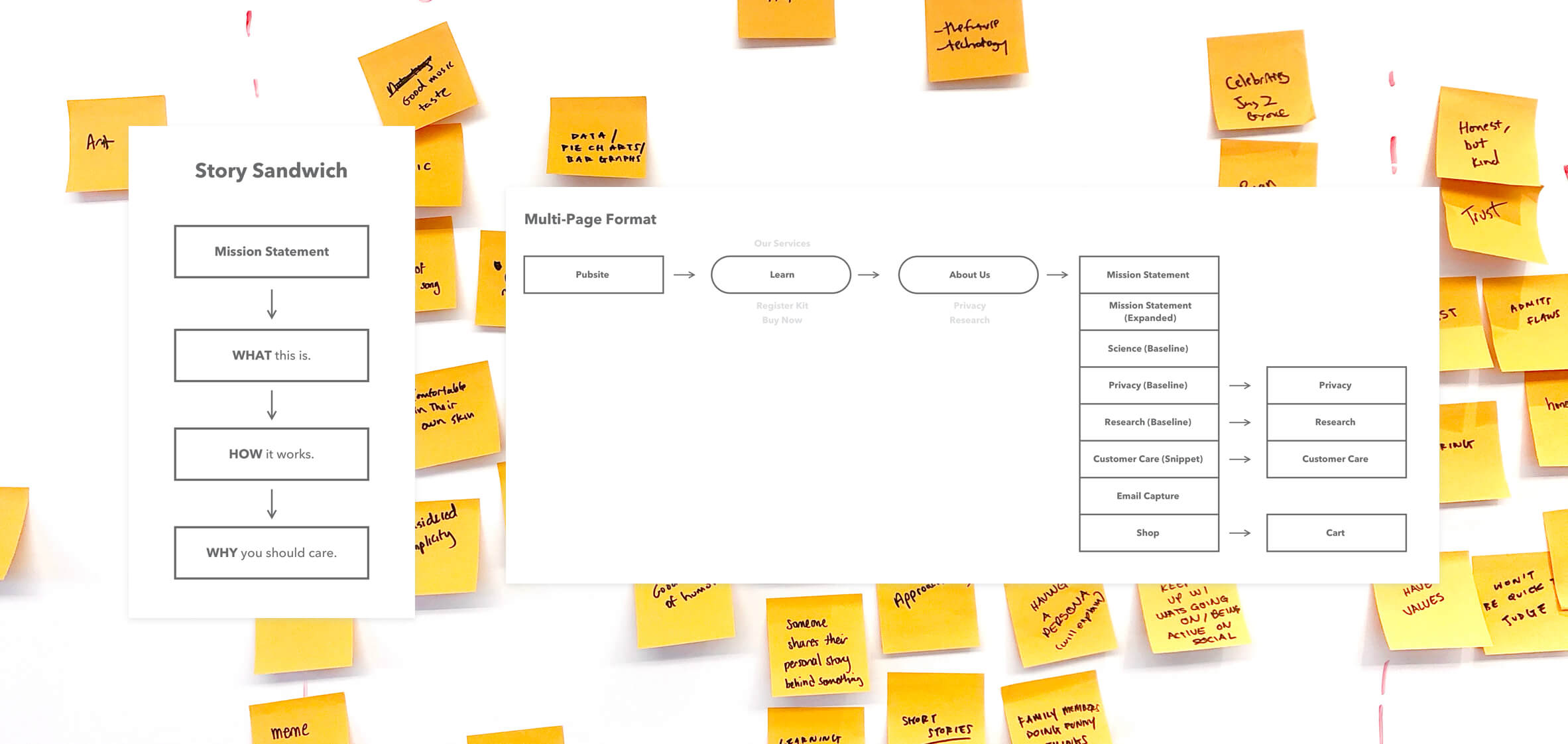
To start this project, we wanted to get an overall sense of what people loved the most about working at 23andMe. I was interested in knowing what employees felt that other people should know about the company— the little bits and pieces that make it such a wonderful place to be and amazing product to use. Before I dove deep into the design, a designer and I went around the office and interviewed co-workers from 8 different teams to get their point-of-view and personal stories. This was actually very inspiring for my design process because I enjoyed listening to the passionate voices of people I saw everyday. In fact, I began seeing them and their work in a different way after the interviews! I dissected key words and phrases from the research and then did a similar brainstorm with the designers and copy writer on the team. Having gathered insights and deliberated with the larger marketing team, I reached a number of approaches that would address company key points while providing a step forward into defining a language of energy for the about page. We were at a turning point with the copy voice of our company, and the about page was going to be our official area to start with it. I followed some general guidelines to help me create a viable look and feel for the page, but also established a new style of illustrating data and science that could be embedded within our design ecosystem.


Process
The research proved to be important in the influence of our copy and concept. With the general recipe of fun, approachable, personable, transparent, confident and continually pushing boundaries, the team was ready to dive deep into wireframes and ideation. The biggest lift was now done, but the next mountain to climb would be to gather consensus between all stakeholders in the company to approve language and design. We needed to all work together to build an about page we could all stand behind.
Solution
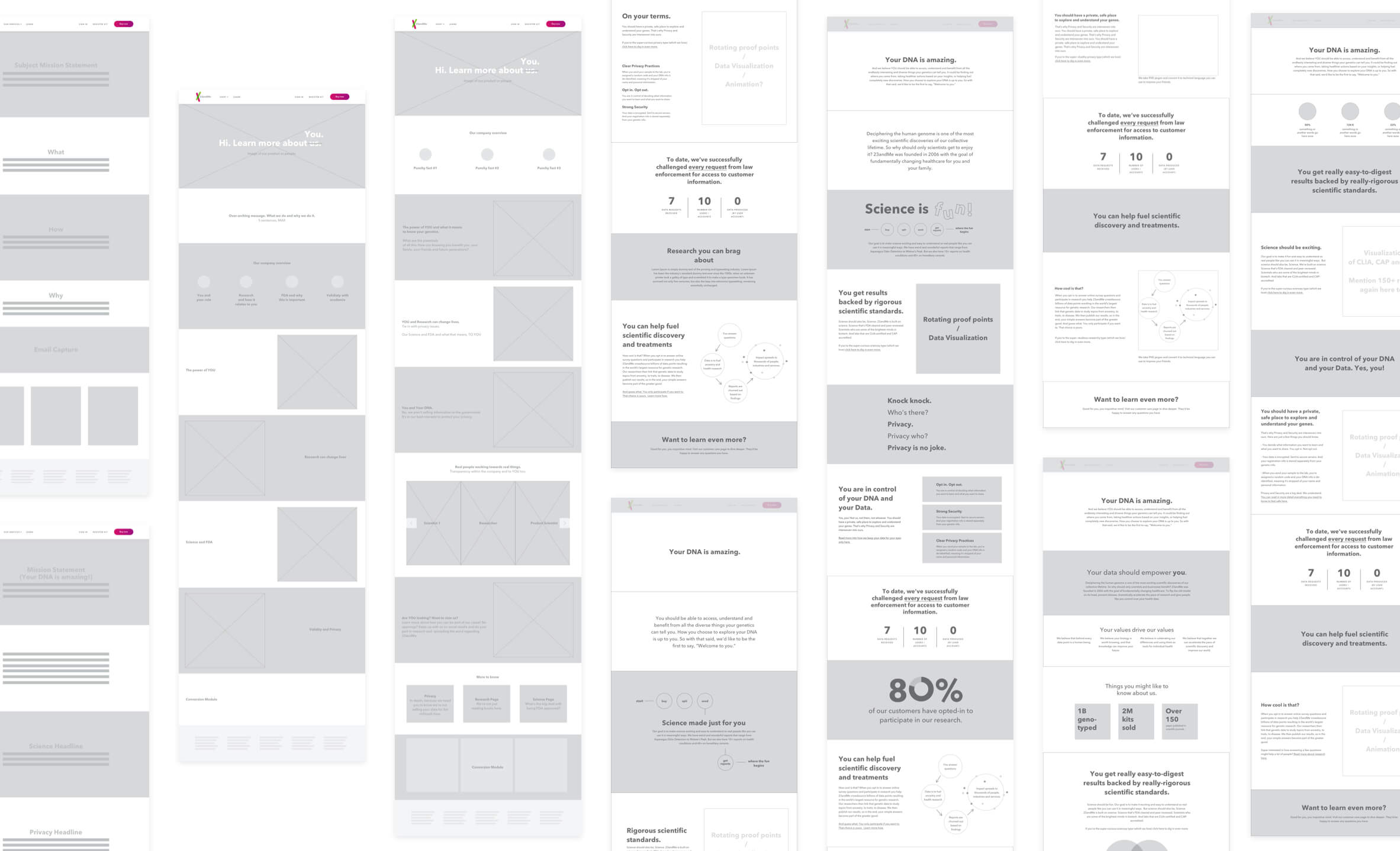
We stood away from a holier-than-thou format in educating people and took on a mentor role in science instead. We're not looking to preach but to just have a conversation. The best way visually express "science is fun" was through the visualization of data. It kept a balance of professional academia but with a witty charm.We aimed to deliver an engaging story to guide visitors down the page and educate them on the building blocks of 23andMe. The page is positioned to get loud and fun, but still be thoughtful and informative. The clean design was inspired by the general 23andMe brand but the fun interpretations stemmed from our employees and culture. The inviting color scheme brings humanity into a usually sterile-looking health industry. The simplified technical information is created to give a clear, compelling story on our science, privacy and research. The end result is an expansion of our brand tone and visual and is the start to updating the rest of our pages. (Note: This page is currently WIP)

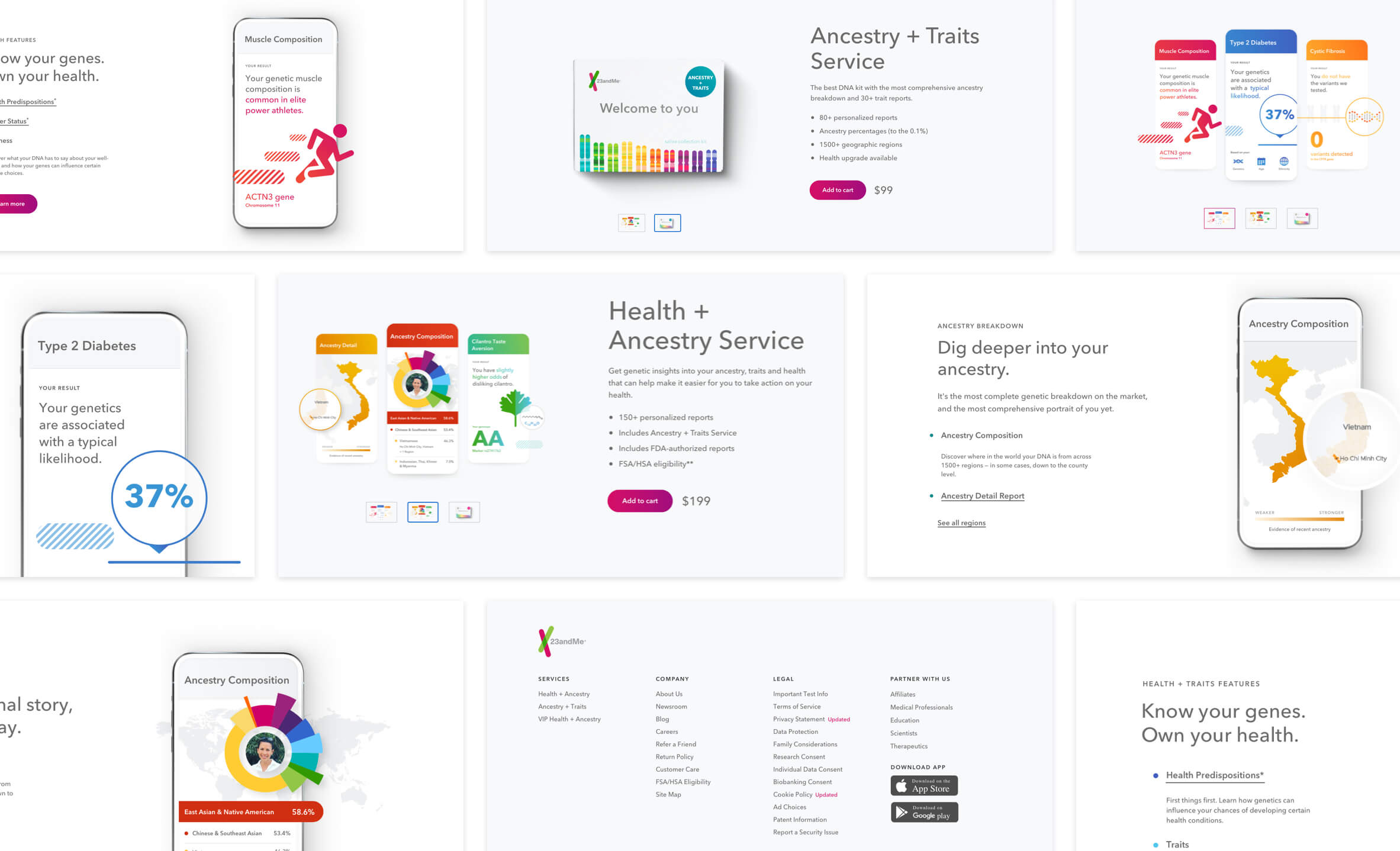
Homepage, Footer and Service Comparison Pages
Along with the about page, 23andMe also needed to update the homepage, footer and product comparison pages. I supported the lead designer in updating assets and user experience. These pages were an ongoing, on and off project that went for over 4 months in which I worked very closely with engineering and Jennifer to push these projects to the finish line. I was onboard about a month and a half into the project and got to support Jennifer in finalizing the homepage. My next step were to take on the footer and re-imagine the design for the top half of our comparison pages.
Role: Supporting Designer for Lead Designer Jennifer Hsu | Copy: Kevin Cranfill